@ VMware Inc. All rights reserved
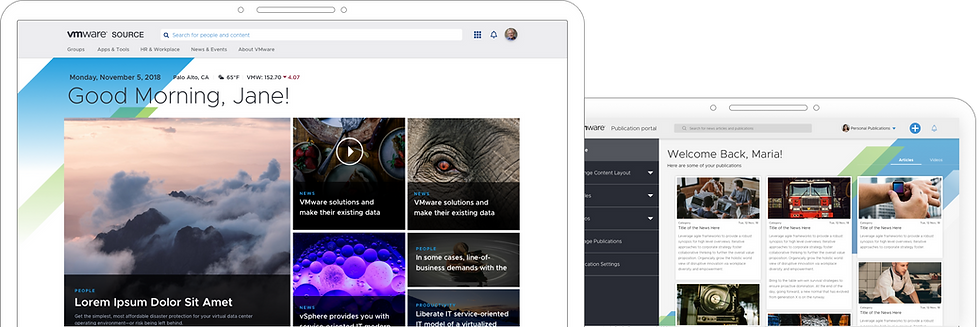
From a static information portal to a personalized, task-oriented hub for 35,000+ employees
Source
The Intranet That Won VMware an NN/g Award
@ VMware Inc. All rights reserved
My Role
-
Co-led the end-to-end redesign as the primary product designer
-
Shaped the vision, defined the design process, and aligned teams
-
Planned and ran user research, including focus groups and interviews
-
Synthesized insights into journeys, personas, and design directions
-
Created UX flows, navigation, IA, and scalable component systems
-
Ran a large scale usability study
Team:
-
2 Product designers
-
Engineering team (front and backend)
-
Product managers
-
Internal comms, HR, IT, and stakeholder teams across VMware
Timeline
14 months, 2018 (Discovery to final release, split across Source Facelift and Source-X initiatives)
Outcome
End-to-end design and implementation of Source Facelift and Source-X
1. Overview
What is Source?
Source is VMware’s intranet platform used daily by over 30,000+ employees. It’s the central place to find company news, access tools, complete tasks, and connect with teams across the organization.
Why redesign it?
The old Source was cluttered, confusing, and hard to maintain. It offered limited personalization, and users often submitted support tickets just to find basic information. Content teams struggled with publishing, and most people used it only when absolutely necessary.
Key Impact
Cut “can’t-find” help tickets by 38 % in first 6 months
Achieved 84.4 SUS usability score (vs. industry avg. 68)
Delivered self-serve Publication Portal and 70-component design system
Recognized in NN/g 2021 Best Intranet list for modern UX and governance
2.1 The Problem
Source had become a passive, outdated tool that users tolerated not one they trusted or enjoyed. Here’s what we saw:
-
Navigation was confusing, and support tickets were common.
-
Pages were manually hardcoded slow to update, hard to maintain
-
Content creation was difficult, needing design or dev help.
-
Everyone saw the same generic view, with no personal relevance.
-
Information felt outdated and hard to trust.
This wasn’t just a UX issue — it was costing time, effort, and user trust.
2.2 The Opportunity
We had a chance to turn Source into something meaningful a home base for VMware employees. Re-shaping how 30K+ employees experience their day at VMware
Our Goals:
-
Shift from passive to proactive
-
Give content owners real control through self-serve tools.
-
Make it personal and useful for every employee.
-
Lay the foundation for a design system flexible enough to evolve without constant redesigns.
-
Align hundreds of teams behind a flexible, consistent system.
We knew it wouldn’t be easy. But if we got it right, it could impact thousands of people, every single day.
3. Discovery and Research
Where We Started
The ask from the business sounded simple:
Make the homepage modern and easier to use
Improve visibility for announcements
Let teams publish without needing design or dev help
Reduce confusion and support tickets
The request from leadership was simple on the surface: “Fix Source.” But under that one-line ask were years of ignored pain, scattered ownership, and broken trust. Our challenge wasn’t just redesigning an intranet it was rebuilding belief in it.
“We stopped using Source years ago”
“I never find what I need”
“We had to Slack someone to find the right link.”
What We Did to Dig Deeper
Business Teams:
stakeholder rounds of Candid conversations to uncover politics, hopes, and roadblocks.
User Notes Compiled:
in their voice expressing pains, goals, vision and aspiration
Hours of 1:1 Interviews:
Deep dives with power users, passive users, and “reluctant returners.”
Focus Groups:
cross-functional sessions across geographies to capture different usage mentalities.
Heuristic Audit: Scored the entire intranet against core usability principles to identify silent pain points.
Content Audit: Reviewed how information was published, how often it went stale, and where ownership failed.
Tools and Methodologies
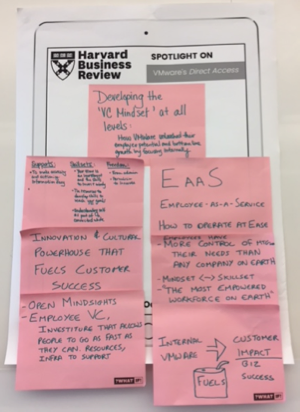
Headlines of the Future
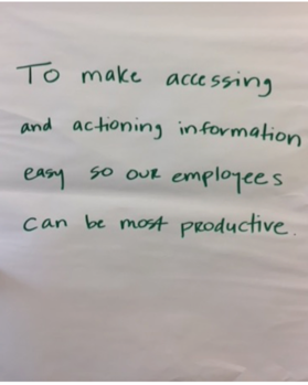
North Star Statement Draft
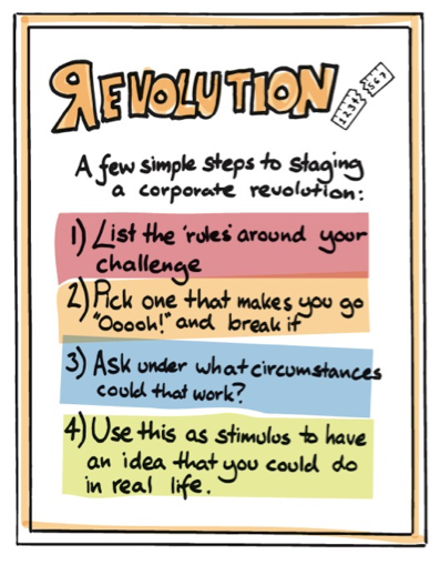
Revolution Exercise
Word Cloud
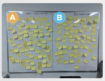
Affinity Mapping
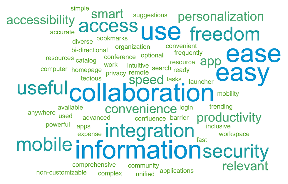
What We Found: Insights That Changed the Brief
Two user mindsets kept surfacing:
Seekers: They know what they want and try to navigate to it.
Wanderers: They don’t know what to look for so they expect the system to surface what’s relevant.
This shift from role-based to mindset-based reshaped our design foundation.

•Convenient
•Accurate
•Easy
•Productivity
•Personalised
Minimalistic Essentials
System Model:
Understand, Suggest and Deliver

•Collaborative
•Extensive
•Smart
•Powerful
•Customisable
Immersive Explorer
System Model:
Anticipate, Learn and Adopt


We uncovered - structural breakdowns
1.
Broken trust in content
When users hit outdated or incorrect info, they stopped relying on the system at all.
2.
No one could publish, and everyone wanted to Even simple edits required design/dev support. Bottlenecks killed agility.
3.
Pushed updates felt spammy
Internal groups wanted attention. But users wanted control over what they saw.
4.
The experience felt passive and cold
Users didn’t feel welcomed, understood, or guided. It was just a wall of links.
View Full User Research
What This Enabled
Modular publishing tools — anyone could update content using pre-built templates.
Smart surfacing — based on behavior patterns and hybrid personalization models.
Fewer support tickets — early usability tests showed ~85% task success without assistance.
Cross-org alignment — stakeholders supported the system once they saw user pain clearly mapped to research insights.
What This Enabled
Giving Power to the Creators
To make Source sustainable, we had to give teams like HR, IT, and Comms more control without chaos.
Personalization, Reimagined
Seeker vs Wanderer wasn’t just a nice insight — it became a core input.
We mapped:
Wanderer modes → surfaced content, role-based cards, recent activity
Seeker paths → clear nav, search, quick access

4. Design Strategy
Experience Shifts We Committed To
This wasn’t about making Source prettier. It was about making it relevant, usable, and human. We reframed Source’s purpose:
“To help every VMware employee know what matters to them, without needing to go look for it.”
This led to three critical pivots:
Different users come for different reasons. We designed for intent, not just org charts.
Updates shouldn’t need a designer. Or a ticket. Or a week.
The homepage became a compass, not a bulletin board.
5. Design Execution
Information Architecture
Source had become a dumping ground—50+ top-level links, most outdated or underused. We distilled this into five core content pillars:
Search, News, Knowledge, Tools, People.
This wasn’t just cleanup—it was strategic clarity. Each pillar reflected a primary user need backed by research and mapped to measurable tasks.

View Full IA
Content Analysis
From content and calendar to search and collaboration, we mapped key modules to what users actually needed—actions, not just information. Each block was designed to be configurable, role-aware, and task-oriented.
Content
Search
Collaboration
Calendar
News
Content block expectation mapping canvas example

User vs Publisher Experience
We designed for both sides—because broken publishing meant broken user experience.
For users:
• Clear task entry points (timecards, expenses)
• Familiar interaction patterns for ease of use
For publishers:
• Templates with tone flexibility
• Role-based access and content freshness controls
• Light onboarding through sessions and walkthroughs

User Journeys
Instead of designing static pages, we focused on real journeys—what users were trying to do. These journeys (e.g., submitting expenses, checking calendars, reading org news) helped prioritize features, surface key content, and reduce friction.
Built journey maps across lifecycle stages: awareness → action → retention
Identified moments of truth like dashboard clarity, relevance of prompts, and follow-up loops
Aligned system behavior with user expectations across touchpoints

View All User Journeys
Phase 1: Source Facelift — Bridging The Gap
Why the Facelift?
The business wasn’t ready for a radical overhaul just yet. A drastic change from the old intranet to Source-X posed adoption risks and required deeper structural work.
To bridge that gap, we created Source Facelift—a strategic refresh that:
Retained familiar interaction patterns to reduce cognitive load.
Fixed critical UX issues from the old platform (like content findability and mobile responsiveness).
Introduced scalable UI and component patterns that would later carry over to Source-X.
What we focused on:
Cleaner homepage with modular zones for content, tools, and news
Improved search clarity and hierarchy
Mobile-friendly layouts for critical flows
Scalable design tokens for future components
Why it worked:
Gained stakeholder trust through quick wins
Allowed us to test interaction patterns early
Set the foundation for Source-X without disrupting current workflows
6. Final Design and Outcomes
Designing for momentum and long-term change
When we started, the ask was simple: fix the intranet.
But what we delivered was a multi-phase evolution—from quick wins to a vision-led platform, reshaping how 30,000+ employees discover, act on, and trust internal content.

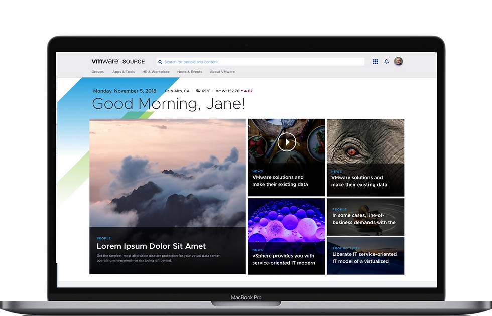
Source - Facelift
1. Source Home
Personalized, modular homepage designed to surface relevant tools, news, and tasks—helping employees start their day with clarity.

Source - Facelift
2. Content - News & Videos
Curated media hubs with filters, tagging, and smart recommendations.

Source - Facelift
3. Apps & Calendar
Quick-access launcher and unified calendar with bookmarking and task actions.

Source - Facelift
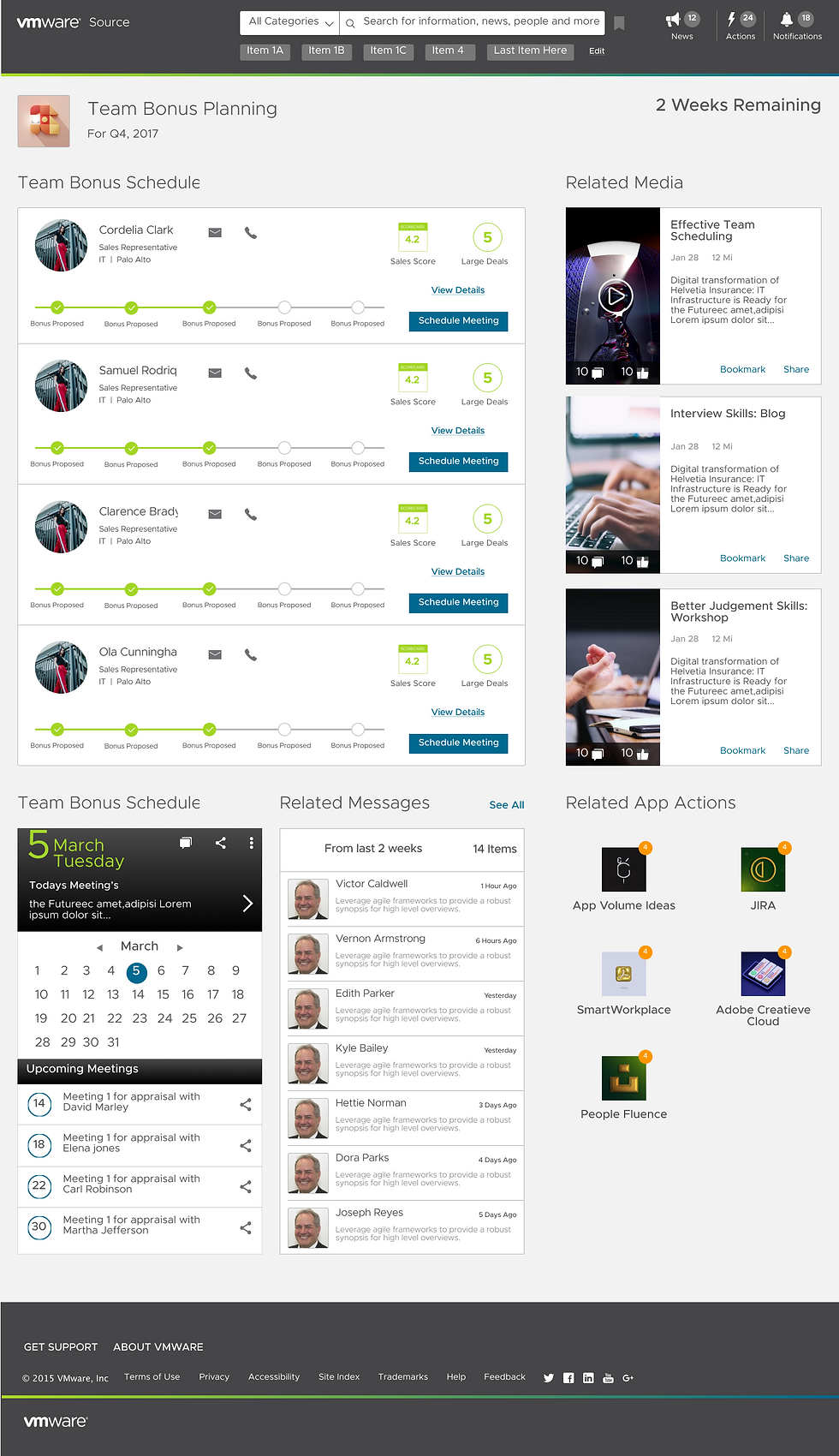
4. Group Pages – HR & IT
Team-specific hubs combining services, goals, and contextual updates.

Source - Facelift
5. Group Pages – HR & IT
Team-specific hubs combining services, goals, and contextual updates.
Phase 2: Source-X — The Real Leap
Where Source Facelift served as a much-needed stabilizer cleaning up visual clutter, introducing hierarchy, and setting the stage—Source-X took the leap. It brought in the deeper changes we had been holding for: the ones that came directly from research, re-architecture, and stakeholder alignment.
We translated months of user research, business priorities, and technical constraints into a platform that finally reflected how employees actually worked. This wasn’t a cosmetic upgrade. It was a rethinking of what the intranet could be—modular, role-aware, and action-oriented.
Source-X brought clarity to users, flexibility to publishers, and confidence to the business.
What That Enabled
📈
+35% increase in platform engagement
🕒
Faster completion times for core tasks like timecards, approvals, and expense submissions
✍️
Publisher satisfaction improved with reusable modules and visibility tools
🧭
Made relevant content 2x easier to find through smarter layout, search and filters
How the Design Reflected Research
-
Modular Components: Each module (calendar, actions, news, people) was derived from the component and user story mapping exercises.
-
User vs Publisher Models: Clear roles, clean interfaces, and guidance without rigidity.
-
End-to-End Journeys: We prioritized layout and information hierarchy around workflows, not static pages.
Final Designs - Source-X
Personalized Dashboard
Smart defaults on Day 1. Dynamic relevance on Day N.
Tailored onboarding leads users into a homepage that evolves with their behavior, what’s pinned, what’s read, and what’s ignored.
Day 1
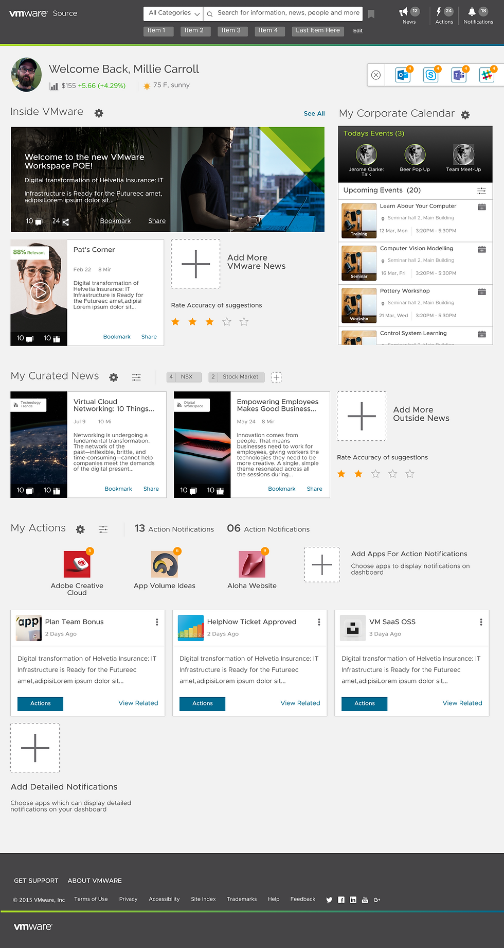
Day N


Smart Search with Tags
Search that understands your role, not just your keywords.
We added filter logic tied to user type and activity, improving search relevance and reducing dead ends.
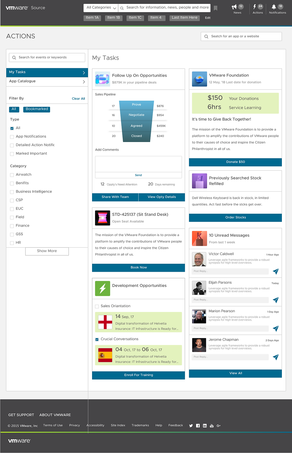
My Actions & Detail View
Everything actionable, all in one place.
From high-level summaries to contextual details and reminders, actions are surfaced clearly—ready to be done, delegated, or dismissed.
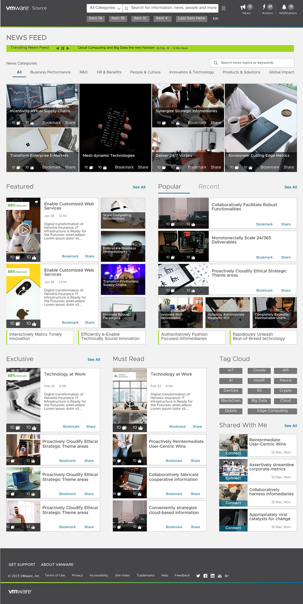
News Page – Push/Pull Information Balance
Less noise. More signal.
We struck a balance between company broadcasts and user-curated feeds. News surfaced by relevance, not hierarchy.
View Full Design
Final Designs - Publication Portal
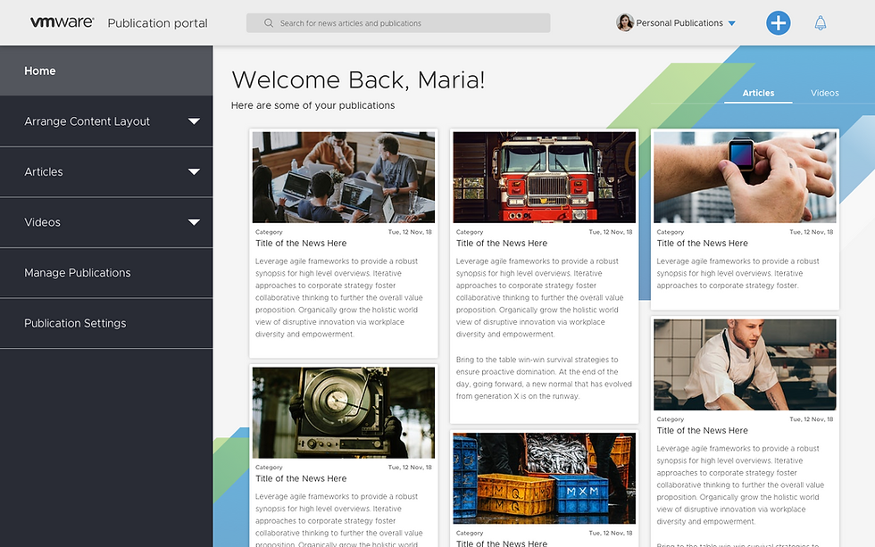
Publication Portal Home
A role-specific gateway that adapts to editorial needs
Tailored layout and content based on user role, guiding contributors through what matters most with clarity and flexibility.
Create Page

Create News
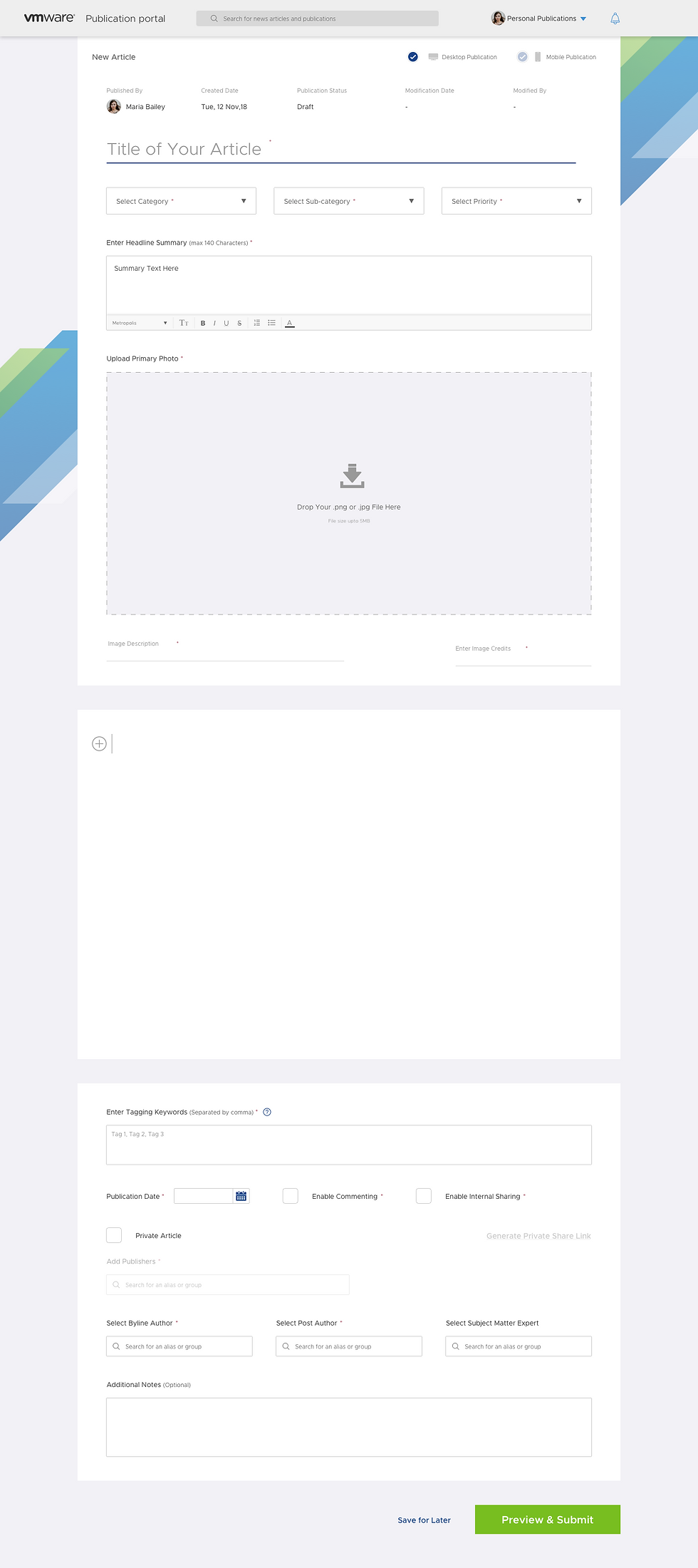
Content Creation – Create Page / Create News Article
Simplified content creation without the chaos
Split flows for page and article creation empower users to structure and publish content confidently, without getting lost in nested menus or unclear forms.
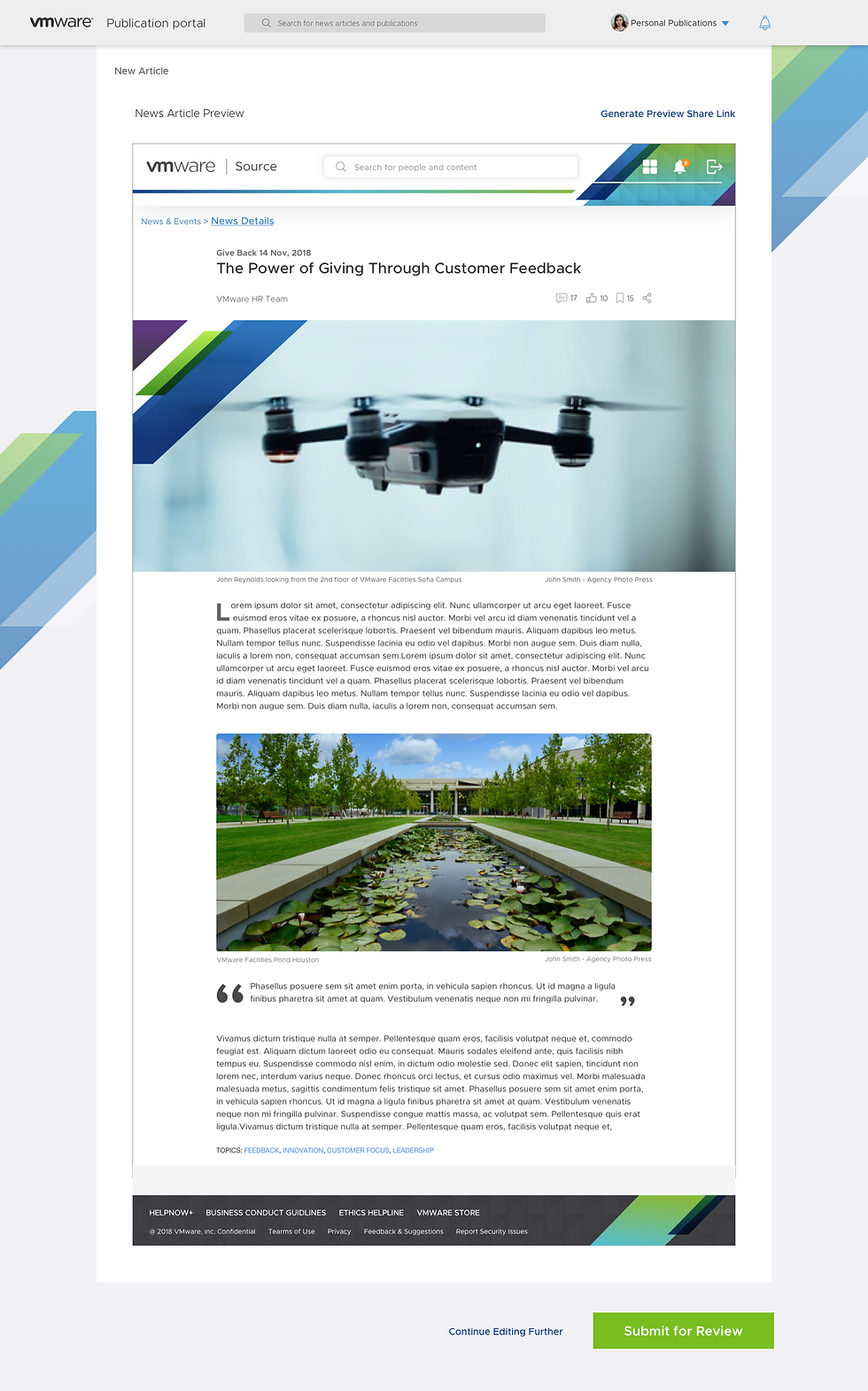
Content Publication – Page Publication / News Publication
Preview with precision before you publish
Built-in visual feedback lets users see exactly how their pages or articles will appear once live, reducing publishing errors and back-and-forth iterations.
Page Publication

News Publication
Content Components – Draft to Publish
Reusable, structured blocks that scale content with consistency
From drafting to live state, modular components empower editors to create rich, well-branded content without design support—ensuring clarity, speed, and consistency at scale.

View Full Design
User Testing & Validation
To ensure Source-X delivered on its promise, we conducted multiple rounds of usability testing with real employees across roles and geographies.
What We Did
Ran 18 moderated sessions across 5 global offices
Tested 6 prototype flows: personalized onboarding, role-based content discovery, event scheduling and more
Used clickstream heatmaps, think-aloud protocols, and post-task interviews
Included power users, new hires, and infrequent users
What We Learned
Design was well-received — 18 of 19 participants successfully completed all tasks.
System Usability Score was 84.47 (industry benchmark is 68).
Participants found the experience intuitive, useful, and efficient, describing it as clean, personalized, and trustworthy.
Personalization expectations were high — 75% expected layouts to adapt to their role and location.
Search emerged as the primary entry point, with participants valuing categories and contextual filters.
Content discoverability improved dramatically, though participants wanted more control in areas like notifications, action cards, and calendar filters.
Users appreciated modular actions and integrated collaboration, but wanted more onboarding guidance for newer features like calendar and news sharing.
Design Improvements Based on Feedback
Refined terminology (e.g., changed “Bookmark” to “Save”) to avoid confusion.
Added support touchpoints and coach marks in complex areas.
Improved layout hierarchy, ensuring key tasks appeared prominently and not buried under scroll.
What It Enabled
Confidence to move forward with phased rollout
Design debt from previous versions cleared with high user satisfaction
Created baseline metrics for post-launch tracking
View Full User Testing
8. Looking Back — and Forward
Redesigning Source wasn’t just a UI overhaul—it was a rethink of how 30,000+ employees engage with their workday.
From scattered links to structured journeys.
From static intranet to adaptive experience.
From publishing chaos to a governed system with clarity and control.
This project challenged every part of the design stack—research, strategy, systems, and storytelling. It taught me how to lead with evidence, listen with intention, and advocate for users while partnering deeply with business and engineering.
But most importantly, it reminded me: the best enterprise tools feel less like portals, and more like partners.
“The real success? When 30,000 people didn’t have to think twice.”
Got questions, thoughts, or feedback? let’s chat. I’m always open to learning more.